Technocolor
Written by Aaron Hammond
05.25.2023
At August Schools, we love color.
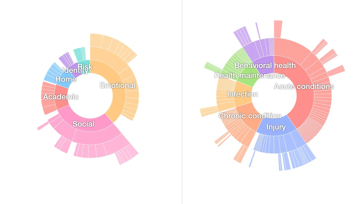
A little color makes anything fun!
In our design system, we deploy color in a few key areas:
- Status, or the position or moment of an object in its lifecycle
- Transitions, or the transformations undergone during a lifecycle
- Identity, or the distinction of a specific element from a larger set
- Category, or the correlation of a subset of distinct elements within a larger superset
Status
Data in our system changes over time as objects complete their lifecycles. These can be short- or long-running. When a user starts importing data into the system, we create a new object in the database to represent the results. As the system makes progress on the import, it may complete or fail. These steps represent four statuses:
- queued, when an import has been requested by the user, but no action has been taken
- importing, when we’ve started to scan files and still detecting records
- finished, when we’ve imported all records from the files requested by the user
- or failed, if there’s been some problem at any step in between
Color is useful to indicate status.
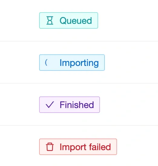
Cyan is a springtime color that evokes a sensation of possibility. Blue indicates dynamicity and activity reinforced by a spinning icon. Purple is august and ultimate, the telos. Red makes you nervous.
Our goal is to pick a color scheme that semantically aligns with the description of the lifecycle. There isn’t really a “correct” choice here that will always induce the reaction we want in the subject. But that doesn’t mean we can’t try.
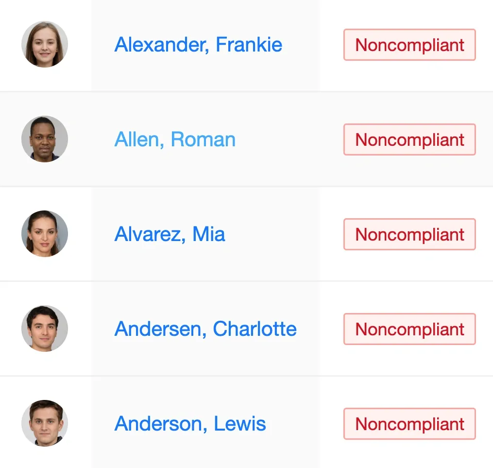
Too much red in one place makes most people anxious. I blame the red pens used to grade homework.
Most of the world uses red for errors and requirements. There are physical and neurological reasons why the reaction the color stimulates is functionally usefully associated with those states.
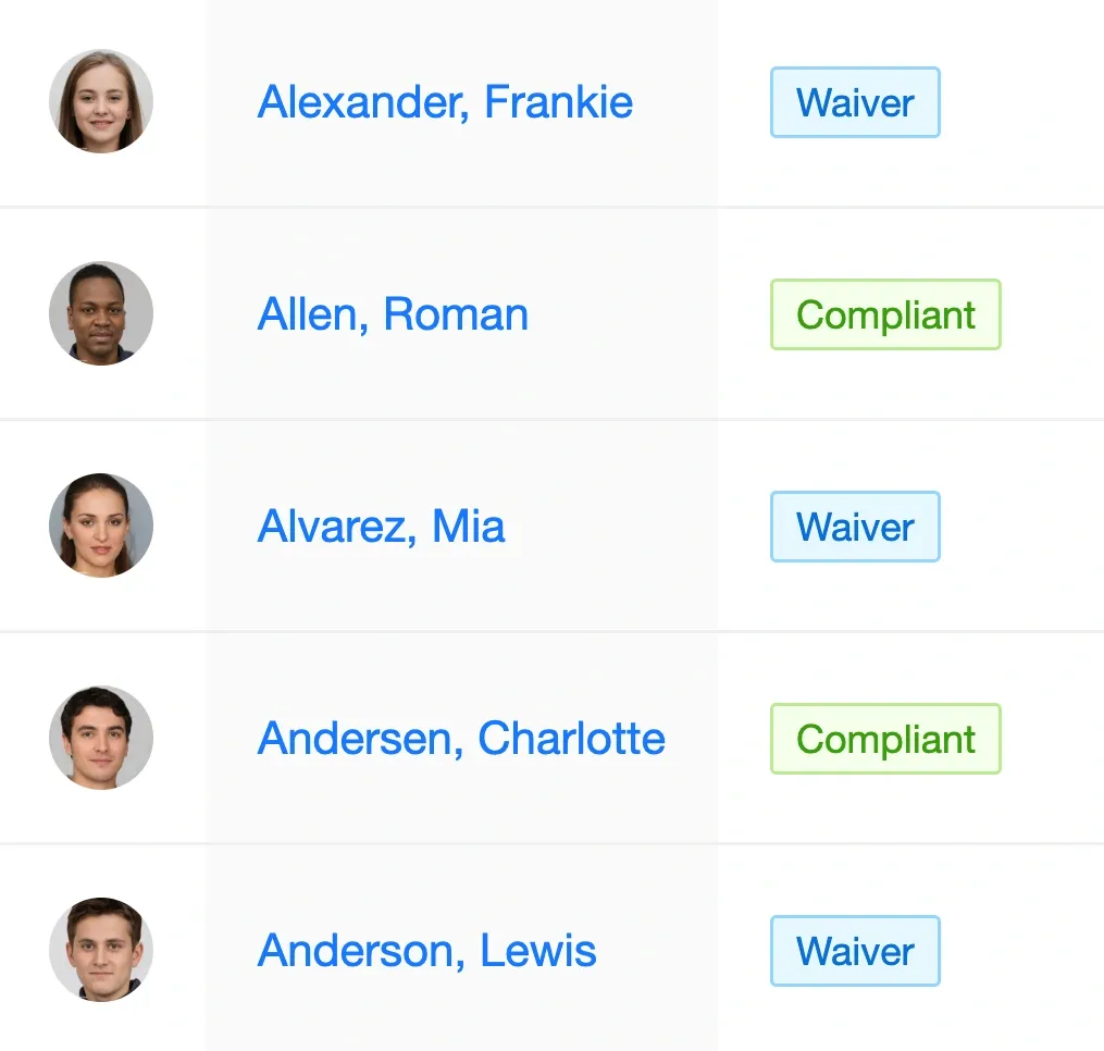
Green and blue -- the hues of ocean, sky, and plant -- are calming to the nerves. You can almost feel the summer breeze and seaspray.
We re-use the same color palette for status across most of the application. It’s important that the semantic impact of a color be consistent.
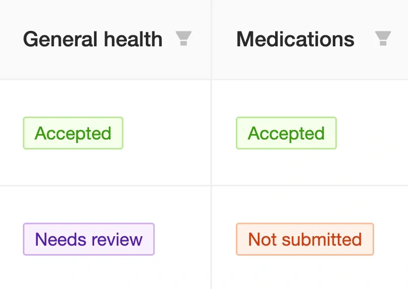
Status colors have different interpretations depending on the object. For form requests, purple signals completion from the parent's perspective, namely submission. We use orange to draw the practitioner's attention to those requests that are still outstanding. Red is close but wouldn't be the right choice here, as this case doesn't require intervention, like a proper failure.
Transitions
As an object progresses through its lifecycle, we say the object transitions. This involves a change in the object’s status to another one of the possible values. When we describe transitions, we care about the original status in addition to the final status.
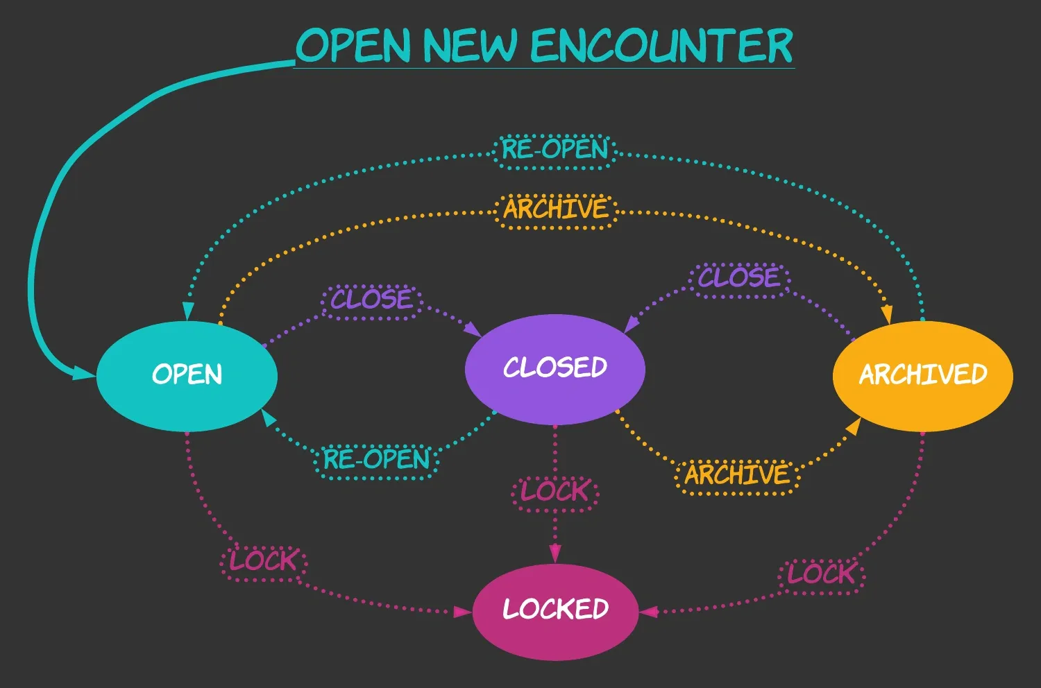
The lifecycle of an encounter can be described using a state machine. This special kind of diagram shows distinct states and the transitions between them. In our case, the states are the different statuses possible for the encounter, and the transitions represent user interactions in the application.
Not all statuses can transition to every other. After a user locks an encounter, the object cannot transition to any other status. We say that locked is a terminal status — transitioning to locked status signals the end of the encounter’s lifecycle. A closed encounter may be re-opened and edited further, then closed again or even archived. Closing an encounter doesn’t end its lifecycle. By contrast, a locked encounter has grown up to all it ever can be.
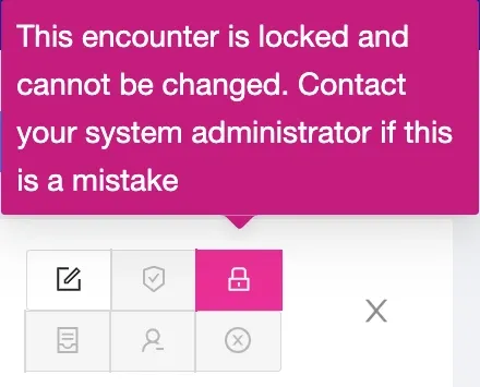
Like orange, magenta is close to red but visibly distinct. Locking an encounter is dangerous. It's neither a required part of the workflow nor necessarily destructive. Some practitioners lock each encounter instead of only closing. For these users, clicking on a red button over and over again would induce needless stress.
All this is to say that our UI has a lot of buttons. I would posit as a law of UI that the number of buttons in an interface strictly increases over time. It’s always worthwhile to try and think of more tailored patterns to a situation, but buttons are easy.
But buttons are dangerous if the person pressing is clicking quickly. We can guardrail here by adding warnings when the user is about the explode the world. We’re all trained by now to ignore these kinds of dramatic pop-ups and click ahead unaffected. We can confirm this by the number of encounters we unlock manually for practitioners.
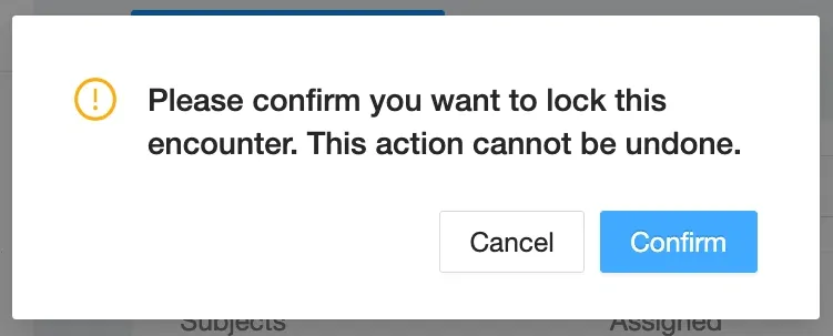
Never say we didn't warn you.
When a practitioner needs to move on from one encounter to another, they don’t care so much about the cute way we label the transition button or even the tooltip. We engineers may wring our hands and mumble about state machines, but users in the moment are reasonably more concerned about outcomes. What happens when I press the button is more important than the reason why I’m allowed to press it or not.
If every button looked the same, I would probably start to notice patterns and learn the rules governing whether a given transition is valid from the current status of the encounter. Knowing that the third button from the right is the one that closes an encounter when the encounter is open, I can more quickly find the correct button without reading each label.
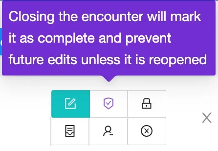
Before pressing a button to transition the status of an encounter, we see the colors of both the start and end states. The color of the end state always appears above the start state's color in the tooltip's background, implying progression.
Things are much easier in color. When I want to transition an encounter to closed status, I don’t really care whether the encounter is archived or open. I just want it closed!
We color each transition button according to the end state achieved by pressing it. Whatever the current status of the encounter, it can be transitioned to a closed status by pressing the big purple button. This is a much gentler and more efficient cue than a label on a button.
Identity
In both the cases of status and transitions, we assign colors to a limited set of enumerated values. Before we ever show a status badge or button on the screen, we know as engineers the complete set of elements we could ever need to express in color.
When we only need to consider four statuses or four transitions, it makes sense for us to try and assign specific colors to each that add meaning given the context they appear. What if we need to color many different elements?
Wherever an avatar is shown in the application, a practitioner can hover over it to see a full-size headshot in a tooltip. A picture is worth a thousand names.
Student avatars are one example in the platform. Wherever we show a list of students, we include a column that displays an avatar that visually represents that kid. We try to use actual thumbnail images of the students whenever possible. When no photo is available, we instead show a colored circle around the initials of the student’s name.
Don't ask how we pick the initials.
In earlier versions, every student avatar in the platform had the same color scheme: blue on blue. Although these colors are personal favorites, the combination and uniformity didn’t make our user interfaces any more efficient!
Beauty is relative, but blue is always trendy.
Documentation is always secondary to student care, so practitioners get interrupted a lot during the day. Their work involves a lot of context switching between the physical world and the digital. When a practitioner has to look away from their screen, it’s helpful to remind them where they were whenever they return to the computer.
In the case of the student roster, we could aspire to remember the name of the prior student after a context switch. This isn’t so easy! We typically sort students alphabetically by last name, so all students with a given last name will appear in the list. For a common last name like “Smith,” these rows could even span multiple pages. It’s hard to remember “Jack Smith” in-between “Jack (John) Smith” and “Jacqueline Smith.” It’s even harder when several students share the same exact name.
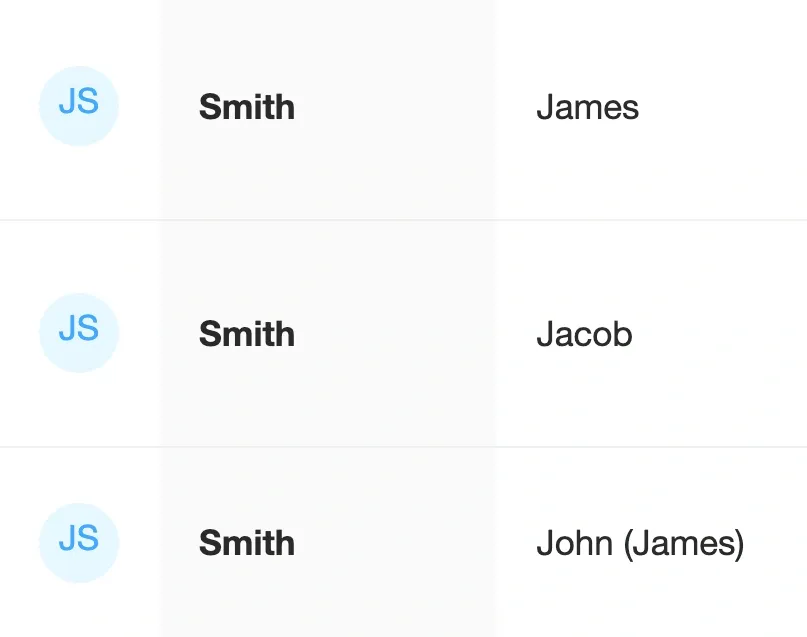
John Jacob Jingleheimer Schmidt is an inspiration. Try staring at these all day.
We distinguish identity using color. Each avatar needs to stand out in the crowd of other avatars. We could assign a unique shade for to each avatar using some formula to generate colors. The effect would be something like mixing all the colors of paint together on the palette: an ugly grayish brown. We want to preserve some perception of order, so we instead restrict ourselves to a discrete, predetermined color palette. Each avatar is permanently assigned a color drawn from this restricted palette.
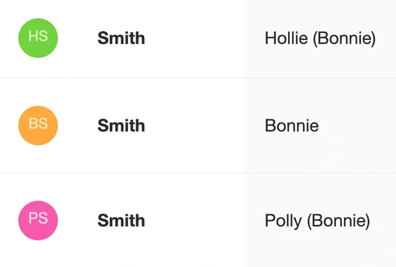
Did you even notice the rhyme?
It’s easier to remember sequences of colors than sequences of very similar names. A particular triplet of avatar background colors is a better cue to the correct position in the list. As long as the assignment of colors is random enough, remembering one adjacent color may be enough even to pick the right row, without reading any names.
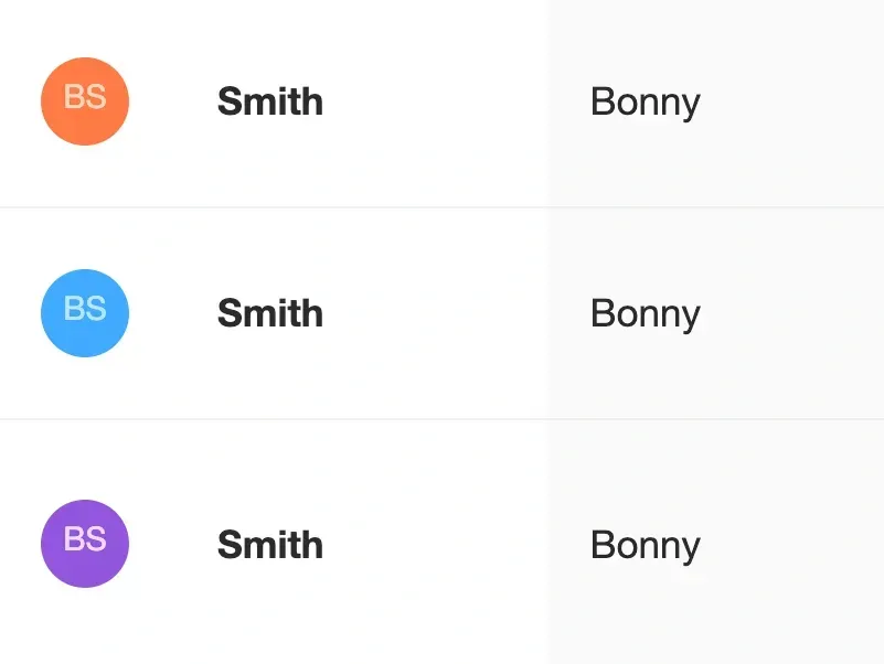
If these avatars all had the same color, you'd probably report a bug. Yet that small difference cues the viewer during the quickest scan through the list.
Category
In the case of identity, the assignment of a color to a particular avatar doesn’t tell the viewer anything about any other avatar on the page. The fact that two students have orange avatars does not imply they share any characteristics between them.
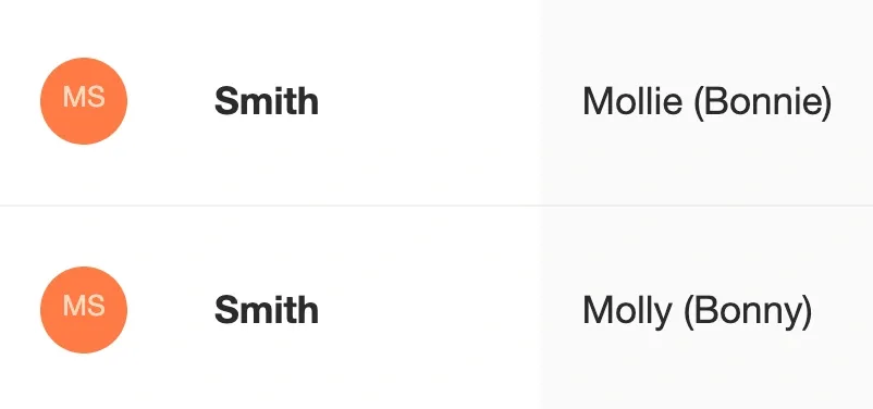
If we assume that computers haven't heard about homophones, the only common factor in the two rows is the last name, Smith. We don't assume the last name drives the selection of color because the hypothesis is quickly disproven by adjacent rows.
In the case of immunization records, we know that each shot date in a grid represents the administration of a particular shot type. There are many shot types, and the number is ever-increasing. It could make sense to color these shot dates in the same way as avatars. This way, it would be easy to scan the readout of the imported PDF and identify which shot dates were administered using the same shot types.
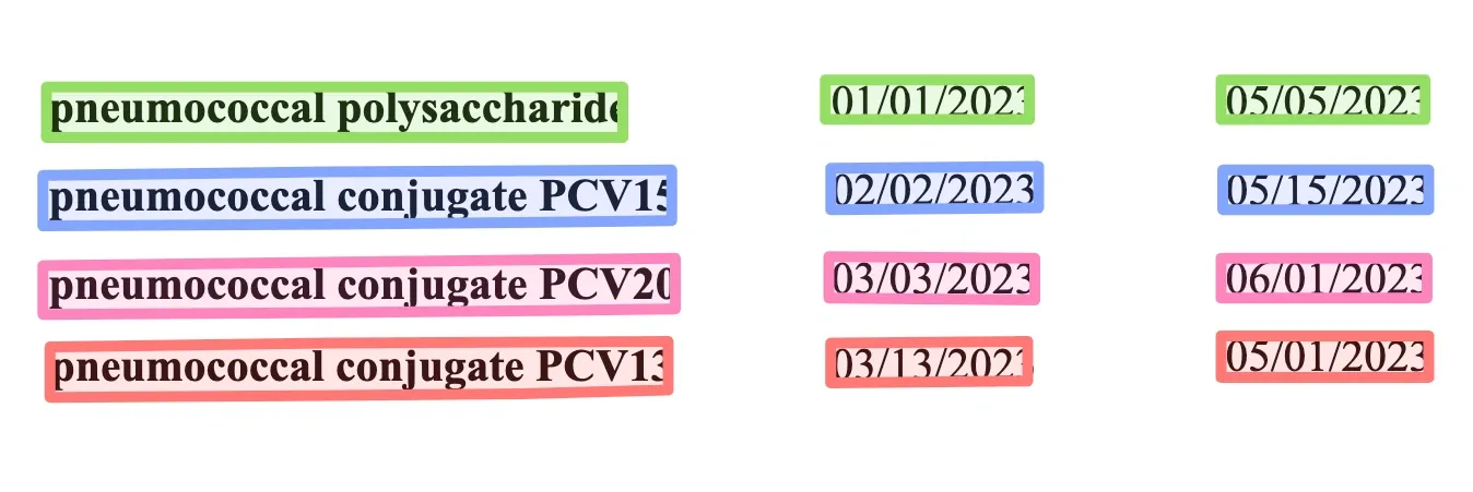
If we colored dates according to shot types, each row in a typical immunization record would be colored differently. Bonus points for style, but less functional upon closer inspection.
This is pretty, but not so useful! Immunization requirements are written in terms of immunization types, not shot types. The distinction here is category. Rather than color each version of the pneumococcal vaccine independently of all the others, we assign color based on the category or type of immunization requirement addressed by that immunization event.

We can use the same logic to color each row of the final shot table as the shot dates. The common concept between the two manifestations is the category represented by a specific immunization type. Orange is ugly, but we have to be consistent.
When elements span multiple categories, like combination shot types that contain multiple types of immunizations, a color gradient quickly communicates otherwise subtle structure. The information gleaned from a single immunization event reinforces the interpretation of every other immunization event on the page. With color, you see much more from a glance than we could hope to say in a tooltip.
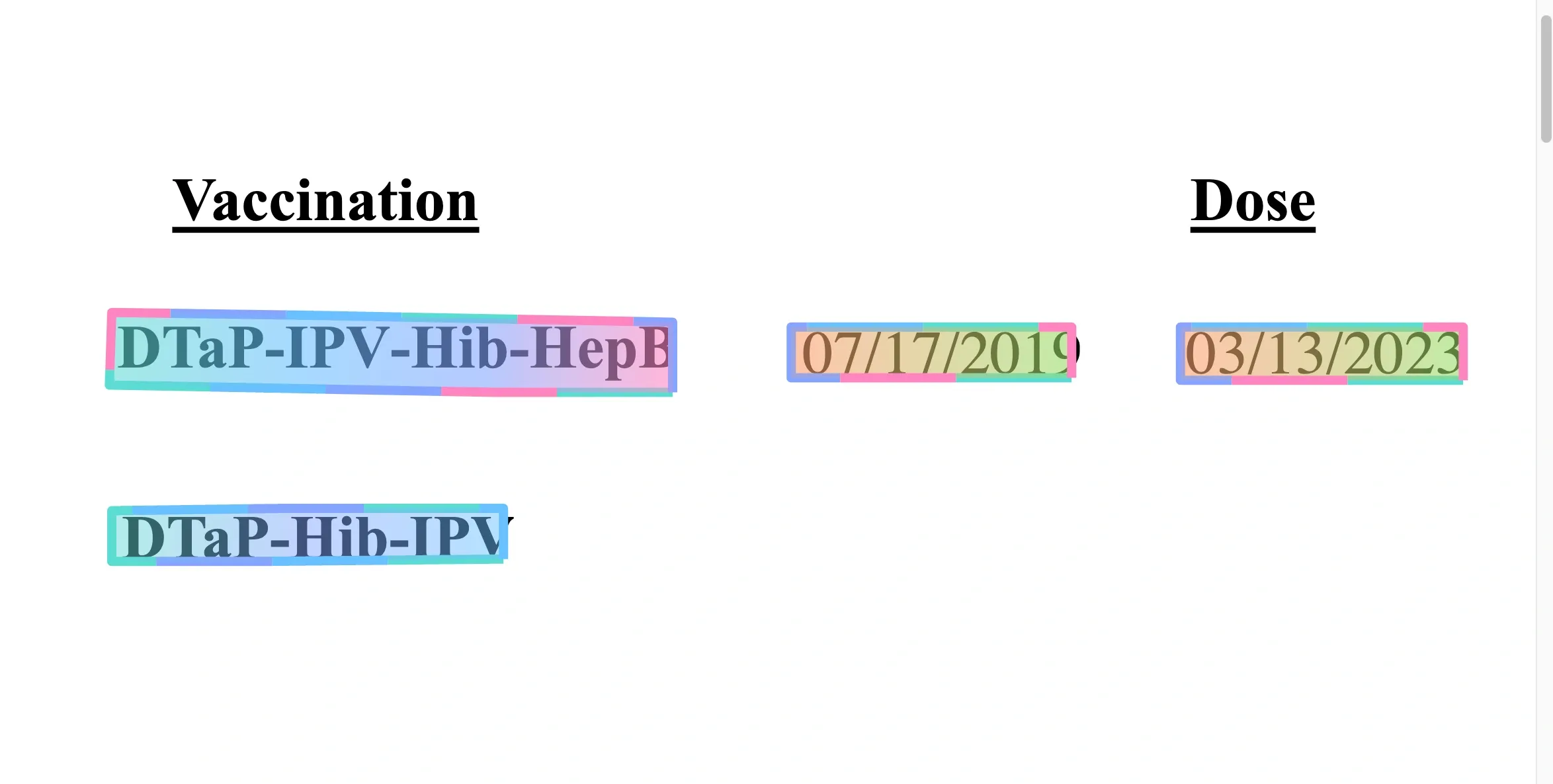
A combination shot may include two, three, or four vaccines in a single administration. The result is a delightful band of color.